Pearson’s r: Measuring the Strength and Direction of Linear Relationships
Learn how Pearson’s r measures the strength and direction of linear relationships between variables. Includes formula breakdown, Python code, and machine learning relevance.
How strongly are two variables related — and in what direction? That’s exactly what Pearson’s correlation coefficient (r) helps us measure.
In this post, you’ll learn what Pearson’s r is, how to calculate it, when to use it, and how it fits into data science and machine learning workflows. We’ll break it down with formulas, visualizations, and Python code so you can apply it confidently in your own projects.
📚 This post is part of the "Intro to Statistics" series
🔙 Previously: Correlation Between Variables: Contingency Tables and Scatter Plots
🔜 Next: Regression: Predicting Relationships Between Variables
🎯 Types of Correlation
There are four main types of correlation you may encounter in data:
- Strong Positive Linear Relationship
- As one variable increases, the other increases in a perfect straight line.
- Weak Positive Linear Relationship
- The variables increase together, but not in a perfect linear fashion.
- Strong Negative Linear Relationship
- As one variable increases, the other decreases in a perfect straight line.
- Perfect Negative Linear Relationship
- A perfect inverse relationship, where every increase in one variable exactly corresponds to a decrease in the other.
However, not all relationships are linear. Many datasets show curves or non-linear relationships, where Pearson’s r would not be applicable.
Visualizing the Types of Correlation and Linear vs Non-Linear Relationships:
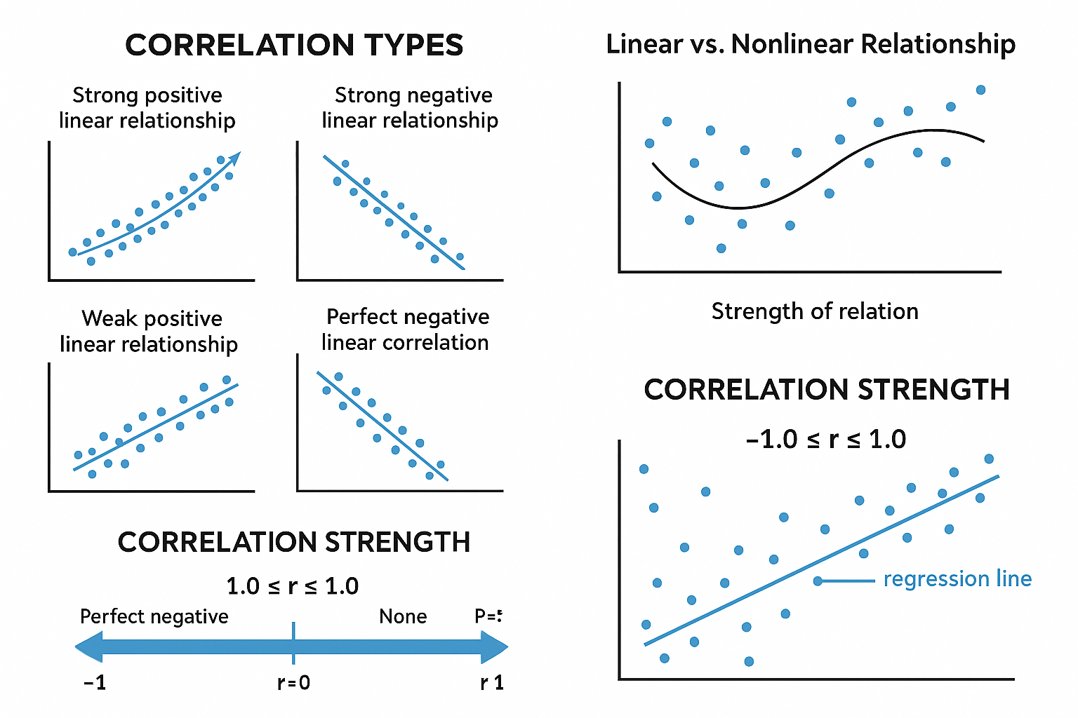
📊 Why Scatter Plots Alone Aren’t Enough
A scatter plot helps visualize the relationship between two variables, but it doesn’t quantify how strong or weak the correlation is.
The scatter plot might show a weak or strong relationship, but it doesn’t give you a precise measurement. For that, we use Pearson’s r, which quantifies both the strength and direction of the relationship.
🧮 The Equation for Pearson’s r
Pearson’s r is calculated as:
\[ r = \frac{\sum (x_i - \bar{x})(y_i - \bar{y})}{\sqrt{\sum (x_i - \bar{x})^2 \sum (y_i - \bar{y})^2}} \]
Where:
- \( x_i \) = data points of variable X
- \( y_i \) = data points of variable Y
- \( \bar{x} \) = mean of variable X
- \( \bar{y} \) = mean of variable Y
📈 How Pearson’s r Works
Pearson’s r produces a value between -1 and +1:
- r = +1 → Perfect positive correlation
- r = -1 → Perfect negative correlation
- r = 0 → No correlation
- 0 < r < 1 → Positive relationship (but not perfect)
- -1 < r < 0 → Negative relationship (but not perfect)
Interpretation:
- Strength: The closer Pearson’s r is to +1 or -1, the stronger the relationship.
- Direction:
- Positive (+) = as one variable increases, the other increases
- Negative (-) = as one variable increases, the other decreases
🤖 Why Pearson’s r Matters in Machine Learning
Pearson’s r is more than just a statistic — it’s a critical tool in feature selection and exploratory data analysis (EDA) in machine learning:
- ✅ Helps detect linear relationships between features and target variables.
- 📉 Can reveal redundant features (multicollinearity) that affect model stability.
- 🔍 Commonly used in correlation matrices for dimensionality reduction or preprocessing.
Understanding correlation guides better feature engineering, a key step for improving model performance.
📉 Visualizing Pearson’s r: How the Data Points Collect Around the Line
Let’s consider how the points align along the line. A strong correlation means the data points are tightly grouped along a straight line.
- Perfect Correlation: Data points lie exactly along the line.
- Weak Correlation: Data points are spread out, but still follow the general trend.
- No Correlation: Data points are scattered randomly.
🧪 Example Calculation
Let’s walk through a small example:
Data:
| X | Y |
|---|---|
| 1 | 3 |
| 2 | 4 |
| 3 | 6 |
| 4 | 8 |
| 5 | 10 |
Now calculate Pearson’s r:
- Calculate the means:
- \( \bar{x} = 3 \)
- \( \bar{y} = 6.2 \)
- Calculate the numerator of the formula:
\[ \sum (x_i - \bar{x})(y_i - \bar{y}) = (1-3)(3-6.2) + (2-3)(4-6.2) + (3-3)(6-6.2) + (4-3)(8-6.2) + (5-3)(10-6.2) \]
\[ = 6.4 + 2.2 + 0 + 1.8 + 7.6 = 18 \]
- Calculate the denominator of the formula (the squared deviations for both variables):
\[ \sum (x_i - \bar{x})^2 = (1 - 3)^2 + (2 - 3)^2 + (3 - 3)^2 + (4 - 3)^2 + (5 - 3)^2 = 4 + 1 + 0 + 1 + 4 = 10 \]
\[ \sum (y_i - \bar{y})^2 = (3 - 6.2)^2 + (4 - 6.2)^2 + (6 - 6.2)^2 + (8 - 6.2)^2 + (10 - 6.2)^2 = 10.24 + 4.84 + 0.04 + 3.24 + 14.44 = 32.8 \]
- Now calculate Pearson’s r:
\[ r = \frac{11.2}{\sqrt{10 \times 32.8}} = \frac{11.2}{\sqrt{328}} = \frac{11.2}{18.1} \approx 0.99 \]
This means the correlation is very strong positive (near-perfect).
🧑💻 Python Code for Pearson’s r
You can also calculate Pearson’s r using Python’s numpy:
1
2
3
4
5
6
7
8
9
10
import numpy as np

# Data
x = np.array([1, 2, 3, 4, 5])
y = np.array([3, 4, 6, 8, 10])

# Calculate Pearson's r
r = np.corrcoef(x, y)[0, 1]
print("Pearson's r:", r)
🧠 Level Up: When Not to Use Pearson’s r
Pearson’s r assumes a linear relationship between two variables. But what if the data forms a curve ?
- 📊 If your data is non-linear , Pearson’s r won’t give you an accurate measure of correlation. The relationship might look like a U-shape or exponential curve, which Pearson’s r can’t capture.
- 🔄 For non-linear relationships , try using Spearman’s rank correlation , which assesses monotonic relationships (whether increasing or decreasing).
- 🎯 Always visualize the data first with a scatter plot to check if the relationship is linear before calculating Pearson’s r.
Understanding when Pearson’s r applies — and when it doesn’t — is key to reliable data analysis.
✅ Best Practices for Using Pearson’s r
- Always plot a scatter plot first to verify linearity.
- Use Pearson’s r for continuous, quantitative variables.
- Report both the r-value and a visual for context.
⚠️ Common Pitfalls
- ❌ Using Pearson’s r on non-linear relationships.
- ❌ Assuming correlation = causation — r only shows association.
- ❌ Using it on ordinal or categorical data.
📌 Try It Yourself
Q: Given the following dataset, calculate the Pearson’s correlation coefficient (r):
| X | Y |
|---|---|
| 1 | 2 |
| 2 | 3 |
| 3 | 2 |
| 4 | 5 |
| 5 | 4 |
Hint: Start by calculating the means, then apply the Pearson's r formula.
💡 Show Answer
✅ Step 1: Calculate the means:
- \( \bar{X} = 3 \), \( \bar{Y} = 3.2 \)
✅ Step 2: Apply the Pearson’s r formula:
- Compute the covariance of X and Y, then divide by the product of their standard deviations.
🔢 Final Result: \( r \approx 0.61 \), indicating a moderate positive linear correlation.
🔁 Summary
| Relationship Type | Pearson’s r Interpretation |
|---|---|
| Strong Positive | ( r = +1 ) |
| Weak Positive | ( 0 < r < 1 ) |
| Strong Negative | ( r = -1 ) |
| No Correlation | ( r = 0 ) |
🎯 Up Next: Regression - Predicting Relationships Between Variables
In our upcoming post, we will delve into regression analysis, which goes beyond correlation to help us predict the value of one variable based on another.
Key points we will cover:
- What is regression?
- Linear regression equation and its components
- How to interpret the regression line in a scatter plot
- How regression helps us predict future values
Stay tuned as we explore this essential technique that forms the backbone of predictive modeling and machine learning!
📺 Explore the Channel

🎥 Hoda Osama AI
Learn statistics and machine learning concepts step by step with visuals and real examples.
💬 Got a Question?
Leave a comment or open an issue on GitHub — I love connecting with other learners and builders. 🔁