From Raw Data to Insight: Cases, Variables, and Frequency Tables
Learn how to organize raw data using cases, variables, data matrices, and frequency tables — the essential building blocks for data analysis and machine learning.
Understanding the structure of your data is the first step in any data analysis or machine learning project. Before you calculate averages or build models, you need to know what your data represents — including its cases, variables, and measurement levels. In this beginner-friendly guide, you’ll learn how to organize raw data using data matrices and frequency tables — two essential tools for clean, structured, and insightful analysis.
Let’s start from the very beginning.
📚 This post is part of the "Intro to Statistics" series
🔙 Previously: Descriptive vs Inferential Statistics
🔜 Next: Choosing the Right Graph: How to Visualize Your Data
👤 What Are Cases?
Cases are the things you’re studying.
Think of them as rows in your data table — each row is a case.
| Case (row) | Student Name | Age | Grade | Favorite Subject |
|---|---|---|---|---|
| 1 | Mariam | 17 | 88 | Math |
| 2 | Youssef | 16 | 75 | Science |
🟦 In this example, each student is a case.
🧬 What Are Variables?
Variables are the characteristics you’re measuring.
They appear as columns in your data.
In the table above:
Age,Grade, andFavorite Subjectare all variables.
🔄 Variable vs. Constant
- A variable changes from case to case
- A constant stays the same
💡 Example: If all students are from the same school, then “School” is a constant — no need to analyze it.
🎯 Levels of Measurement
Not all variables are created equal. They differ by what kind of values they hold.
| Level | Description | Example |
|---|---|---|
| Nominal | Categories with no order | Favorite Subject |
| Ordinal | Categories with order | Satisfaction (Low/Med/High) |
| Interval | Numbers, but no true zero | Temperature (°C) |
| Ratio | Numbers with true zero (can divide) | Age, Grade |
📌 Why it matters: Some statistical methods only work for certain levels!
🧱 The Data Matrix
A data matrix is simply a big table:
- Rows = cases
- Columns = variables
🧩 It looks like a spreadsheet — great for analysis but hard to show here.
Often, datasets are too large to present in full on a website or paper.
That’s why we use a simpler summary:
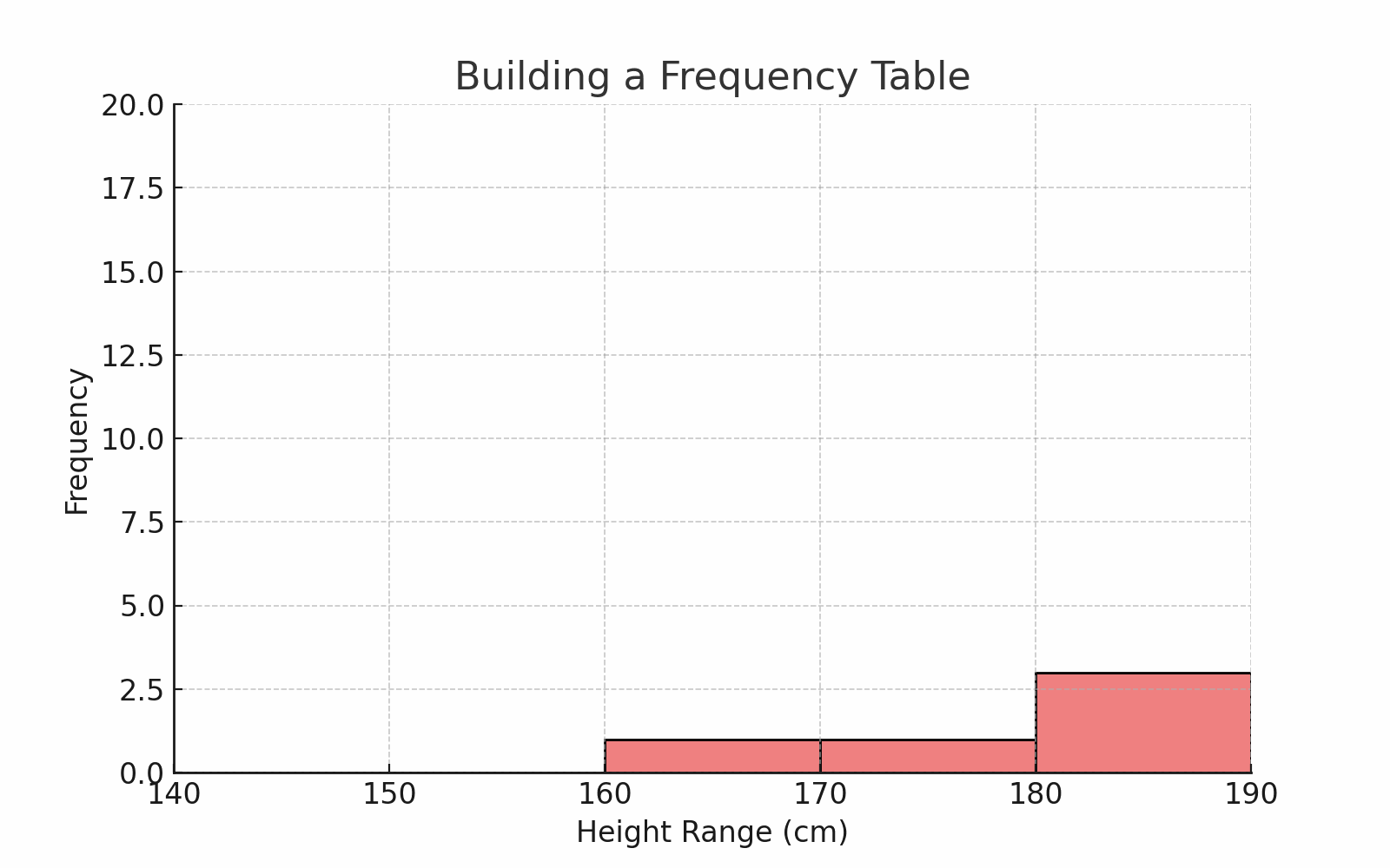
📊 The Frequency Table
A frequency table tells us how often something appears in our data.
Let’s say you collected heights of 50 students.
You can group them into intervals like this:
| Height Range (cm) | Frequency |
|---|---|
| 140–149 | 3 |
| 150–159 | 10 |
| 160–169 | 20 |
| 170–179 | 12 |
| 180–189 | 5 |
🎯 This helps us see patterns — like more students being in the 160s.
🧠 For continuous data like height or age, this method is perfect.
🖼️ Diagram: Frequency Table vs Raw Data
🤖 How Is This Related to Machine Learning?
Understanding cases, variables, and frequency tables is essential for any machine learning project:
- Cases are the data points your model will learn from (e.g., each row in your dataset could be a customer, an image, or a transaction).
- Variables are the features (columns) that describe each case. These features are what the model uses to find patterns and make predictions.
- Levels of measurement determine how you preprocess variables: categorical variables may need encoding (like one-hot encoding), while numerical variables might need normalization.
- Frequency tables help you explore and understand the distribution of your data, spot class imbalance in classification problems, and detect outliers or errors before modeling.
In short, before you build a machine learning model, you must first organize, describe, and understand your data using these basic statistical tools. This ensures your model is built on a solid foundation and can learn meaningful patterns.
🧠 Level Up: The Importance of Data Types and Structure in Machine Learning
Understanding your data’s structure is crucial before any analysis or modeling:
- 📋 Cases represent individual units of observation — like rows in a spreadsheet.
- 📊 Variables describe characteristics or features of those cases — like columns.
- 🔢 Recognizing whether variables are categorical or quantitative guides how you summarize, visualize, and model your data.
- 📈 Properly structured data helps prevent errors and ensures meaningful machine learning outcomes.
- ⚠️ Common Pitfall: Mixing variable types without proper encoding can cause ML models to perform poorly.
Getting these basics right is the foundation of all successful data science work.
🧪 Hands-On Practice
Try creating a frequency table yourself!
- Use any small dataset (e.g., your favorite movies, sports stats, or a sample from Kaggle).
- Group a continuous variable into intervals and count frequencies.
- Share your results or questions in the comments or GitHub repo.
💻 Challenge yourself: Open the interactive notebook and create your own frequency tables!
📌 Try It Yourself
Q: You’re given a table of patient data with the following columns:
- 🆔 Patient ID
- 🎂 Age
- 🩺 Blood Type
- 📍 City
- 🧪 Cholesterol Level
What would be considered a single case in this dataset?
💡 Show Answer
✅ A row in the table — that is, one patient’s full record.
Each case represents one unit of observation (like a patient), while each variable is a column describing something about that case (e.g., age, blood type, city).
🔁 Summary
| Concept | Meaning |
|---|---|
| Case | One item/person we study |
| Variable | A feature that varies across cases |
| Constant | A value that doesn’t change |
| Levels of Measurement | Tells us how to handle the data |
| Data Matrix | A full table of all cases and variables |
| Frequency Table | A summary of how often values appear |
✅ Up Next
In the next post, we’ll build and visualize frequency tables using Python
- With code and charts
- For both categorical and continuous data
💬 Have a dataset you’re working with? Share it in the comments or GitHub — let’s explore it together!
Stay tuned!
📺 Explore the Channel

🎥 Hoda Osama AI
Learn statistics and machine learning concepts step by step with visuals and real examples.
💬 Got a Question?
Leave a comment or open an issue on GitHub — I love connecting with other learners and builders. 🔁