Correlation Between Variables: Contingency Tables and Scatter Plots
Learn how to analyze relationships between variables using correlation techniques like contingency tables and scatter plots, based on whether your data is categorical or quantitative.
Understanding how two variables relate is a core step in data analysis — and that’s where correlation comes in.
But choosing the right correlation method depends on your data type: are your variables categorical or quantitative? In this post, we’ll break down the key approaches — from contingency tables to scatter plots — so you can analyze relationships with confidence.
📚 This post is part of the "Intro to Statistics" series
🔙 Previously: A Real-World Statistics Example
🔜 Next: Understanding Pearson's R
🎓 Real-Life Case: Study Habits and Exam Performance
Imagine a high school counselor wants to investigate the relationship between how often students study and whether they pass or fail a weekly quiz.
She surveys 30 students and records two things:
- 📚 Study Time Category: Rarely, Sometimes, Often
- ✅ Quiz Result: Pass or Fail
🧮 Step 1: The Contingency Table
This type of table is used for categorical variables. It shows how often combinations of categories occur.
| Study Frequency \ Quiz Result | Pass | Fail | Total |
|---|---|---|---|
| Rarely | 3 | 7 | 10 |
| Sometimes | 6 | 4 | 10 |
| Often | 9 | 1 | 10 |
| Total | 18 | 12 | 30 |
🔁 Step 2: Conditional Proportions
The raw counts don’t tell the full story. So we calculate the percentage of each outcome within each group.
For example:
- Among students who study Rarely, 3/10 passed = 30%
- Among those who study Often, 9/10 passed = 90%
| Study Frequency | % Passed | % Failed |
|---|---|---|
| Rarely | 30% | 70% |
| Sometimes | 60% | 40% |
| Often | 90% | 10% |
✅ These are conditional proportions — percentages within each row.
📊 Step 3: Understanding Proportions — Quick Summary
We use conditional proportions to look within groups, and marginal proportions to summarize a variable on its own.
- Conditional example:
Among those who study Rarely → 3/10 passed = 30% - Marginal example:
Overall pass rate → 18/30 = 60%
📚 Want a full breakdown with examples, visual tables, and when to use each?
👉 Read: Conditional vs. Marginal Proportions →
🔍 Step 4: Interpreting the Categorical Correlation
The more a student studies, the more likely they are to pass.
We can see a positive association in the conditional proportions:
- Rarely study → low pass rate
- Often study → high pass rate
➡️ But contingency tables don’t quantify correlation — they only show patterns.
🔄 Step 5: Let’s Make It Quantitative
Now let’s change the scenario:
The counselor asks students for their exact number of study hours per week and records their quiz scores out of 100.
Here’s a sample:
| Hours Studied | Quiz Score |
|---|---|
| 2 | 50 |
| 3 | 55 |
| 5 | 65 |
| 7 | 70 |
| 8 | 76 |
| 10 | 85 |
| 12 | 92 |
📈 Step 6: Scatter Plot
This type of plot is perfect for quantitative variables.
It helps us visually assess correlation:
- Each point = one student
- X-axis: Hours studied
- Y-axis: Quiz score
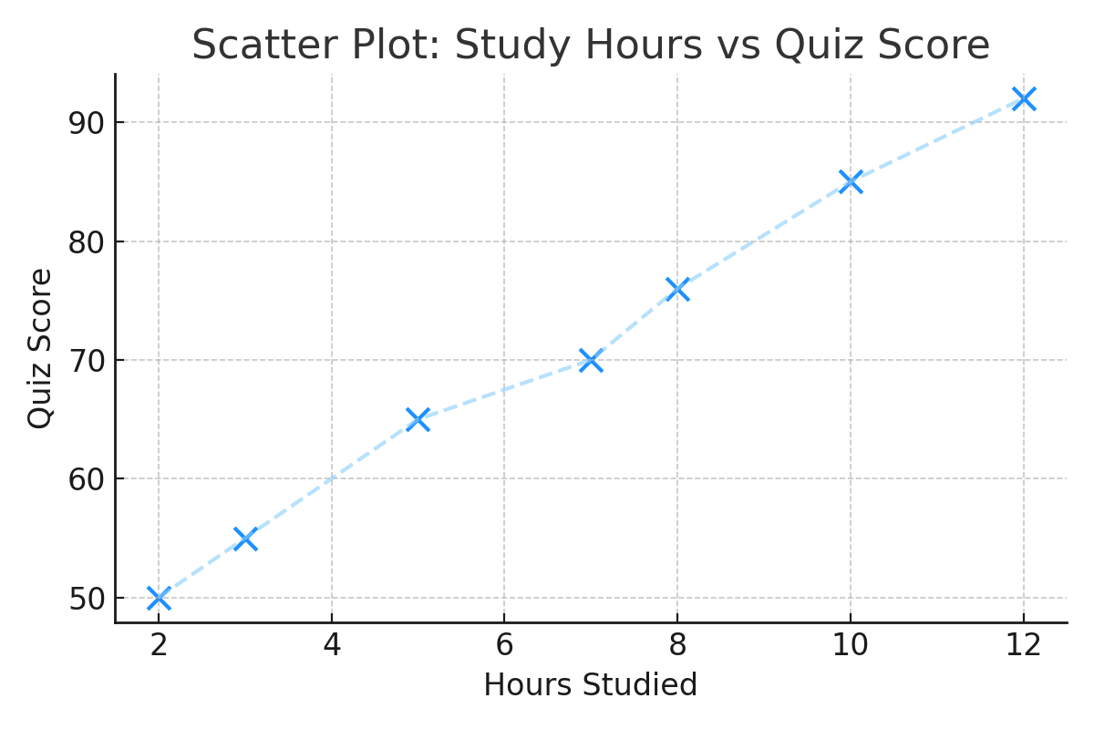
You’ll notice: the more hours students study, the higher their scores.
This is a strong positive relationship.
✅ Best Practices When Exploring Variable Relationships
- Start with simple visuals like scatter plots or tables before jumping into modeling.
- Use scatter plots to spot linear or curved patterns between numeric variables.
- For categorical data, contingency tables show how categories relate.
- Always ask: “Can this help my model make better predictions?”
- Use a correlation metric (like Pearson’s r) for numerical comparisons.
⚠ Common Pitfalls to Avoid
- Assuming correlation means causation — just because two variables move together doesn’t mean one causes the other.
- Ignoring outliers — one extreme value can distort your scatter plot or correlation result.
- Overlooking non-linear patterns — not all relationships are straight lines. Try other visuals or transformations.
- Using the wrong chart — don’t use a scatter plot for categorical data; use a contingency table instead.
- Forgetting to check variable types — always know what kind of data you're working with before analyzing relationships.
🧠 Level Up: Choosing the Right Correlation Approach Based on Data Types
Correlation analysis isn’t one-size-fits-all — the type of variables determines the best method:
- 📊 For two quantitative variables, measures like Pearson's r capture linear relationships.
- 📋 For two categorical variables, contingency tables and tests like Chi-square help assess association.
- 🔄 For mixed variable types, specialized methods like point-biserial correlation or ANOVA are used.
Understanding your data types ensures you pick the most powerful and appropriate analysis technique.
📌 Try It Yourself
Q: Imagine you're analyzing students’ test scores, and a few unusually high scores raise the mean. Which measure of center gives a more accurate picture of the typical student’s performance — mean or median?
💡 Show Answer
✅ Median — because it's resistant to outliers, unlike the mean which gets skewed. The median focuses on the middle value, so a few extreme values won't distort it, making it more reliable in such cases.
🤖 Why It Matters in Machine Learning
In machine learning, understanding relationships between variables helps you:
- 📊 Choose the right features for your model (feature selection).
- 📉 Detect multicollinearity — too much correlation between features can hurt model accuracy.
- 🧪 Engineer new features based on strong associations (e.g., combining study time and pass rate).
- 📈 Pick the right models — strong linear correlation? Consider regression. Categorical outcomes? Try classification.
Learning how to interpret contingency tables and scatter plots builds your EDA skills, a core part of every data science pipeline.
✅ Conclusion
| Type of Data | Tool to Use | Example |
|---|---|---|
| Categorical (Nominal/Ordinal) | Contingency Table | Study Frequency vs Pass/Fail |
| Quantitative | Scatter Plot | Hours Studied vs Quiz Score |
🧠 Choose the right tool based on your variable types.
🔜 Up Next
Next, we’ll calculate the Pearson correlation coefficient (r) — a number that tells us how strong a linear relationship really is.
📺 Explore the Channel

🎥 Hoda Osama AI
Learn statistics and machine learning concepts step by step with visuals and real examples.
💬 Got a Question?
Leave a comment or open an issue on GitHub — I love connecting with other learners and builders. 🔁