How to Build Frequency Tables in Python (With Charts)
Learn how to create frequency tables in Python for both categorical and numerical data using Counter, pandas, and numpy — and visualize them with bar charts and histograms.
Before building a machine learning model or exploring data in Python, you need to understand how your data is distributed. This guide walks you through creating frequency tables for both categorical and continuous data — and visualizing them using bar charts and histograms with Python libraries like pandas, numpy, and matplotlib.
📚 This post is part of the "Intro to Statistics" series
🔙 Previously: Choosing the Right Graph: How to Visualize Your Data
🔜 Next: Measuring the Center: Mean, Median, and Mode Explained
👉 Understand your data.
That’s where frequency tables come in — they help you summarize your raw data and reveal hidden patterns. In this post, you’ll learn how to create frequency tables in Python and visualize them with charts.
We’ll cover:
✔️ What frequency tables are
✔️ Why they matter
✔️ How to build them for both categorical and numerical data
✔️ How to plot them with bar charts and histograms
📊 What is a Frequency Table?
A frequency table shows how often each value appears in your data. It’s a way to take messy raw numbers and turn them into something readable — a summary that helps you spot patterns fast.
🟡 Imagine you asked 20 people about their favorite fruit. Here’s the data:
1
2
3
4
fruits = ['apple', 'banana', 'apple', 'orange', 'banana', 'banana',
          'apple', 'banana', 'orange', 'apple', 'banana', 'banana',
          'orange', 'apple', 'apple', 'banana', 'banana', 'apple',
          'orange', 'banana']
We want to know: how many chose each fruit?
🔢 Step 1: Count Frequencies for Categorical Data
1
2
3
4
from collections import Counter

fruit_counts = Counter(fruits)
print(fruit_counts)
📌 Output:
1
Counter({'banana': 9, 'apple': 7, 'orange': 4})
🎯 This is your frequency table. It tells you that:
- 9 people chose banana 🍌
- 7 people chose apple 🍎
- 4 people chose orange 🍊
🐼 Alternative: Using pandas for frequency tables
If your data is in a pandas DataFrame, you can use value_counts() for one way tables and pd.crosstab() for two way tables.
1
2
3
4
5
6
import pandas as pd

df = pd.DataFrame({'fruit': fruits})

# One way frequency table
print(df['fruit'].value_counts())
Example output:
1
2
3
4
banana    9
apple     7
orange    4
Name: fruit, dtype: int64
🔄 Two-Way Frequency Tables (Contingency Tables)
1
2
3
4
5
6
7
df = pd.DataFrame({
    'fruit': ['apple', 'banana', 'apple', 'orange', 'banana', 'banana'],
    'color': ['red', 'yellow', 'green', 'orange', 'yellow', 'green']
})

table = pd.crosstab(df['fruit'], df['color'])
print(table)
Example output:
1
2
3
4
5
6
color   green  orange  red  yellow
fruit
apple       1       0    1       0
banana      1       0    0       2
orange      0       1    0       0
📈 Relative and cumulative frequency
So far we counted how many times each value appears. You can also look at:
- Relative frequency - the proportion or percentage of the total
- Cumulative frequency - the running total as you move through ordered values
Using pandas, relative frequency is easy:
1
2
3
4
5
6
7
8
9
10
11
12
import pandas as pd

df = pd.DataFrame({'fruit': fruits})

freq = df['fruit'].value_counts()
rel_freq = df['fruit'].value_counts(normalize=True)

print("Frequency:")
print(freq)
print("\nRelative frequency:")
print(rel_freq)
Example output:
1
2
3
4
5
6
7
8
9
10
11
12
Frequency:
banana    9
apple     7
orange    4
Name: fruit, dtype: int64

Relative frequency:
banana    0.45
apple     0.35
orange    0.20
Name: fruit, dtype: float64
For ordered numerical data, you can also compute cumulative frequency:
1
2
3
4
5
6
7
8
9
10
11
scores = pd.Series([85, 90, 85, 88, 92, 85, 90])

freq = scores.value_counts().sort_index()
cum_freq = freq.cumsum()

print("Frequency:")
print(freq)
print("\nCumulative frequency:")
print(cum_freq)
📊 Step 2: Visualize It with a Bar Chart
1
2
3
4
5
6
7
import matplotlib.pyplot as plt

plt.bar(fruit_counts.keys(), fruit_counts.values(), color='skyblue', edgecolor='black')
plt.title("Favorite Fruit Survey")
plt.xlabel("Fruit")
plt.ylabel("Frequency")
plt.show()
🧠 This simple chart helps you immediately see which fruit is most popular — bar charts are perfect for categorical data.
📏 Step 3: Frequency Table for Numerical Data
What if your data is continuous? Like heights or ages?
Let’s simulate 50 students’ heights:
1
2
3
4
import numpy as np

heights = np.random.normal(loc=165, scale=10, size=50)
bins = [140, 150, 160, 170, 180, 190]
Now create a frequency table using intervals:
1
2
3
4
counts, bin_edges = np.histogram(heights, bins=bins)

for i in range(len(counts)):
    print(f"{int(bin_edges[i])}–{int(bin_edges[i+1])}: {counts[i]}")
📌 Output (varies by run):
1
2
3
4
5
140–150: 2
150–160: 6
160–170: 21
170–180: 15
180–190: 6
This means:
- Most students are in the 160–170 cm range
- Very few are shorter than 150 or taller than 180
📉 Step 4: Plot It with a Histogram
1
2
3
4
5
plt.hist(heights, bins=bins, color='lightgreen', edgecolor='black')
plt.title("Height Distribution")
plt.xlabel("Height (cm)")
plt.ylabel("Frequency")
plt.show()
Unlike bar charts, histograms have connected bars — they’re designed for continuous data. 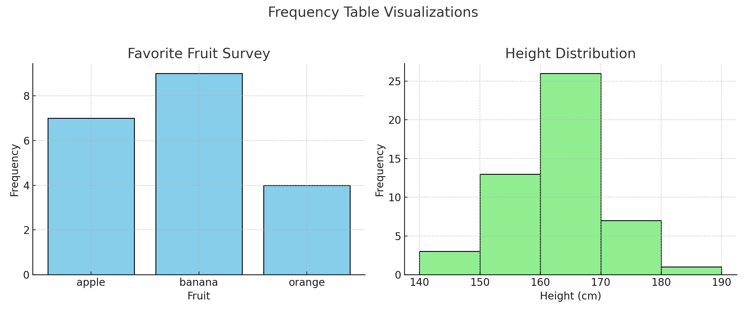
Tip:
For discrete numerical data (like test scores), you can also usevalue_counts()to create a frequency table:
1
2
3
import pandas as pd
scores = [85, 90, 85, 88, 92, 85, 90]
pd.Series(scores).value_counts().sort_index()
Histogram Best Practices:
- Always label your x-axis and y-axis clearly, including units (e.g., “Height (cm)”).
- Use a consistent y-axis scale when comparing multiple histograms.
- Start the y-axis at zero unless there is a strong reason not to, and indicate clearly if you do otherwise.
🧠 Why Frequency Tables Matter
- They help you understand distributions at a glance.
- Let you detect outliers, rare categories, or unexpected values.
- Support data preparation for machine learning, for example:
- Choosing how to encode categorical variables.
- Deciding how to group continuous values into bins.
- Detecting strong class imbalance before training a classifier.
Frequency tables are also a first step toward more advanced tools such as descriptive statistics, histograms, box plots, and probability distributions.
✅ Best practices for frequency tables and histograms
- Start with simple counts. Build a basic frequency table to see which categories or values are common and which are rare before doing more complex analysis.
- Sort tables in a meaningful way. For categorical data, sort by category or by frequency depending on what you want to highlight. For numeric values, sort by value to match the natural order.
- Use relative frequency when comparing groups. Convert counts to proportions or percentages when sample sizes differ between groups or datasets.
- Choose bins thoughtfully for numerical data. Pick bin edges that are easy to interpret and that match the scale of the data, rather than relying only on automatic binning.
- Combine tables with visualizations. Use bar charts and histograms alongside frequency tables so that patterns are visible both numerically and visually.
⚠️ Common pitfalls with frequency tables and histograms
- Using too many or too few bins. Very few bins can hide important structure, while too many bins can create noisy patterns that are hard to interpret.
- Ignoring missing values. If you do not handle missing values explicitly, frequency tables and histograms can give a misleading picture of the data.
- Not sorting numerical frequencies. For ordered or numeric data, leaving the index unsorted can make tables and bar charts harder to read.
- Mixing up bar charts and histograms. Bar charts are for categories, histograms are for continuous intervals. Using the wrong one can confuse the message.
- Reading counts without context. Large counts or bars can look impressive, but always interpret them relative to the total sample size and to other categories.
🧠 Level Up: Leveraging Frequency Tables for Deeper Data Insights
Frequency tables are more than simple counts — they’re powerful tools for exploring and preparing data:
- 🔢 For categorical data, frequency tables reveal the distribution and highlight dominant categories.
- 📊 For numerical data, grouping values into intervals in frequency tables helps uncover patterns and anomalies.
- 🧑💻 Building frequency tables programmatically (e.g., with Python’s
pandas) enables scalable and reproducible analysis. - 🎨 Visualizing frequency tables with bar charts or histograms bridges raw numbers to intuitive understanding.
Mastering frequency tables will improve your data wrangling and make your visualizations more meaningful.
📌 Try It Yourself
Q: You have a list of 100 product categories (like Electronics, Clothing, Books, etc.).
What type of chart and table would help you best understand the distribution of these categories?
💡 Show Answer
✅ Use a frequency table to count how many times each category appears, and a bar chart to visualize it.
Since this is categorical data, bar charts and frequency tables are ideal for summarizing and comparing counts.
Bonus: What if instead you had 100 numerical values showing product prices?
💡 Show Answer
✅ Use a frequency table with intervals (like 0–50, 50–100) and a histogram to visualize the distribution.
Since prices are continuous numerical data, histograms show how values are spread across ranges.
✅ Summary
| Task | Tool |
|---|---|
| Count categories | Counter() |
| Visualize categories | Bar chart |
| Group continuous data | numpy.histogram() |
| Visualize continuous data | Histogram |
🚀 Coming Next
In the next post, we’ll take this frequency data and calculate powerful summary statistics like:
- Mean
- Median
- Standard deviation
Stay tuned!
📺 Explore the Channel

🎥 Hoda Osama AI
Learn statistics and machine learning concepts step by step with visuals and real examples.
💬 Got a Question?
Leave a comment or open an issue on GitHub — I love connecting with other learners and builders. 🔁