Bringing It All Together: A Real-World Stats Example
Walk through a complete real-world statistics example using test scores: calculate mean, median, range, IQR, standard deviation, z-scores, and visualize it with dot and box plots.
In this post, we’ll walk through a real-world case study that uses core statistical tools: mean, median, standard deviation, box plots, and z-scores. Whether you’re prepping data for machine learning or analyzing student scores, these skills are essential for interpreting numbers with confidence.
🎓 Real-Life Scenario
Imagine you’re a school data analyst. A math teacher gives you the scores from a recent algebra quiz taken by 10 high school students.
The teacher wants to know:
- Are these scores typical?
- Are there any unusually high or low performers?
- What is the best way to summarize this small dataset?
📚 This post is part of the "Intro to Statistics" series
🔙 Previously: Z-Score: Comparing Values Across Distributions
🔜 Next: Correlation Between Variables
🧾 The Data
The scores (out of 100):
[ [44, 47, 49, 51, 52, 53, 55, 57, 90, 95] ]
🔍 Step 1: Type of Variable
These are quantitative values — actual test scores.
Since there are only 10 observations, we can visualize them easily.
📊 Step 2: Dot Plot
Here’s what the scores look like when placed on a dot plot:
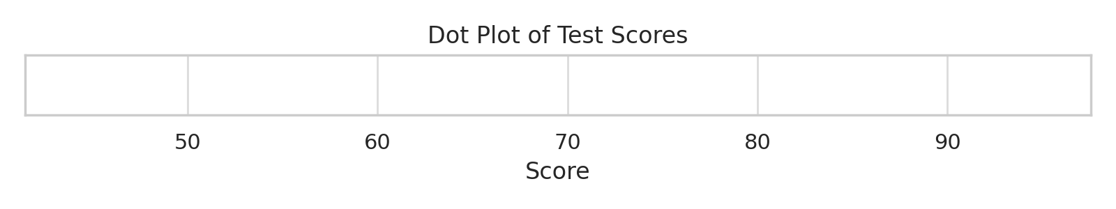
Two students (scoring 90 and 95) seem to have performed far better than the rest — possible outliers.
📈 Step 3: Measuring the Center
To summarize where most students scored:
- Mode: None (all values are unique)
- Median: Middle two scores = ( (52 + 53) / 2 = 52.5 )
- Mean:
\[ \bar{x} = \frac{\sum x}{n} = \frac{593}{10} = 59.3 \]
🔍 Because two students scored much higher than the rest, the mean is pulled upward, and the median gives a more typical score.
📐 Step 4: How Spread Out Are the Scores?
Let’s measure variability to see if most students were close to the average.
- Range = 95 − 44 = 51
- IQR:
- Q1 = 49, Q3 = 57 → IQR = 8
- Standard Deviation (rounded):
\[ \sigma \approx 17.0 \]
➡️ This tells us there’s a wide spread, especially due to the top scorers.
📦 Step 5: Visualizing Spread with a Box Plot
Box plots are great when you want to see:
- Center
- Spread
- Outliers — all at once
Here’s what it looks like for these scores:
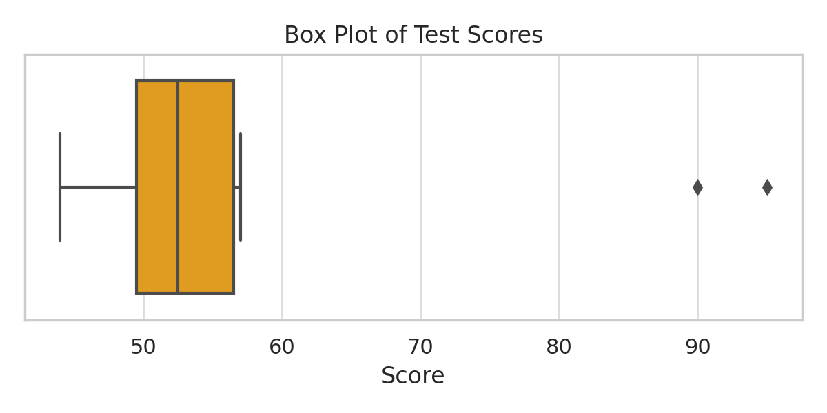
You can clearly see the outliers to the far right.
🧮 Step 6: Z-Score for the Top Student
Let’s calculate how far the score of 90 is from the average:
\[ z = \frac{90 - 59.3}{17.0} \approx 1.8 \]
🟢 A z-score of 1.8 means this student scored 1.8 standard deviations above the mean — a strong performance.
🧪 Try It in Python
Here’s how to compute some of the same stats using Python:
1
2
3
4
5
6
7
8
9
10
11
12
13
import numpy as np

scores = [44, 47, 49, 51, 52, 53, 55, 57, 90, 95]

mean = np.mean(scores)
median = np.median(scores)
std_dev = np.std(scores)
z_score = (90 - mean) / std_dev

print("Mean:", mean)
print("Median:", median)
print("Std Dev:", std_dev)
print("Z-score for 90:", z_score)
🧠 Tip: Use ddof=1 if you’re calculating sample standard deviation.
📌 Try It Yourself
Q: Imagine you're analyzing students’ test scores, and a few unusually high scores raise the mean. Which measure of center gives a more accurate picture of the typical student’s performance — mean or median?
💡 Show Answer
✅ Median — because it's resistant to outliers, unlike the mean which gets skewed. The median focuses on the middle value, so a few extreme values won't distort it, making it more reliable in such cases.
🧠 Level Up: Interpreting Outliers and Variability in Real Data
This example highlights important concepts in real-world data analysis:
- 📉 Outliers can dramatically affect the mean but have less influence on the median and IQR.
- 📦 Box plots visually summarize both center and spread, making it easy to spot unusual values.
- 🧮 Z-scores quantify how far points deviate from the mean, helping identify exceptional cases objectively.
- 🔎 Combining these tools provides a holistic understanding of data distribution, crucial for accurate analysis and decision making.
Mastering these interpretations will improve your data intuition and prepare you for advanced statistical techniques.
🧠 Summary Interpretation
The teacher’s intuition was right:
Most students scored between 44–57, but two students (90, 95) scored exceptionally high, pulling the mean up.
The median and IQR give a better picture of the typical student’s performance, while the box plot and z-scores confirm the presence and magnitude of outliers.
✅ Up Next
Next time, we’ll begin our journey into probability — the language of uncertainty and how it powers statistical thinking.
Stay tuned!
📺 Explore the Channel

🎥 Hoda Osama AI
Learn statistics and machine learning concepts step by step with visuals and real examples.
💬 Got a Question?
Leave a comment or open an issue on GitHub — I love connecting with other learners and builders. 🔁