Choosing the Right Graph: How to Visualize Your Data in Statistics
Learn which graph to use for categorical or quantitative data, and how bar charts, pie charts, and histograms help in understanding your data — especially in machine learning.
In data science and machine learning, visualizing your data is one of the first — and most important — steps. This post shows how to choose the right graph (bar chart, pie chart, histogram) based on the type of data you have.
In this post, we’ll explore:
- How to choose a graph based on your data type
- The difference between bar charts, pie charts, and histograms
- The different shapes of histograms (and what they tell us)
📚 This post is part of the "Intro to Statistics" series
🔙 Previously: Descriptive vs Inferential Statistics
🔜 Next: Frequency Tables with Python
📋 1. Graphs for Categorical Data (Nominal & Ordinal)
Categorical data includes labels, names, or categories.
There are two types:
- Nominal: No order (e.g., eye color, favorite food)
- Ordinal: Ordered categories (e.g., rating from poor to excellent)
🔹 Best graphs for categorical data:
Bar Chart
- Each category is a separate bar
- Bar height = frequency
- Bars are separated (not touching)
Python Example: Bar Chart
1
2
3
4
5
6
7
8
9

import matplotlib.pyplot as plt

labels = ['A', 'B', 'C', 'D', 'E']
sizes = [10, 15, 7, 12, 9]
plt.pie(sizes, labels=labels, autopct='%1.1f%%', startangle=90)
plt.title('Pie Chart Example')
plt.show()
Pie Chart
- Shows parts of a whole
- Best when you want to show percentages or proportions
Python Example: Pie Chart
1
2
3
4
5
6
7
import matplotlib.pyplot as plt

labels = ['A', 'B', 'C', 'D', 'E']
sizes = [10, 15, 7]
plt.pie(sizes, labels=labels, autopct='%1.1f%%', startangle=90)
plt.title('Pie Chart Example')
plt.show()
💡 Tip: Bar charts are usually easier to read than pie charts — especially with many categories.
📊 2. Quantitative Data: Interval and Ratio
Quantitative data is numerical, like height, age, or test scores.
This includes:
- Interval: No true zero (e.g., temperature in °C)
- Ratio: Has a true zero (e.g., weight, age)
🔸 Best graph for quantitative data:
Histogram
- Bins or intervals group data (for example, ages 10-19, 20-29, and so on)
- Bars are adjacent to represent continuous intervals on the x axis
Python Example: Histogram
1
2
3
4
5
6
7
8
9
10
import matplotlib.pyplot as plt

data = [22, 55, 62, 45, 21, 22, 34, 42, 42, 4, 99, 102, 110, 120, 121, 122, 130, 111, 115, 112, 80, 75, 65, 54, 44, 43]
bins = [0, 20, 40, 60, 80, 100, 120, 140]

plt.hist(data, bins=bins, color='orange', edgecolor='black')
plt.xlabel('Value')
plt.ylabel('Frequency')
plt.title('Histogram Example')
plt.show()
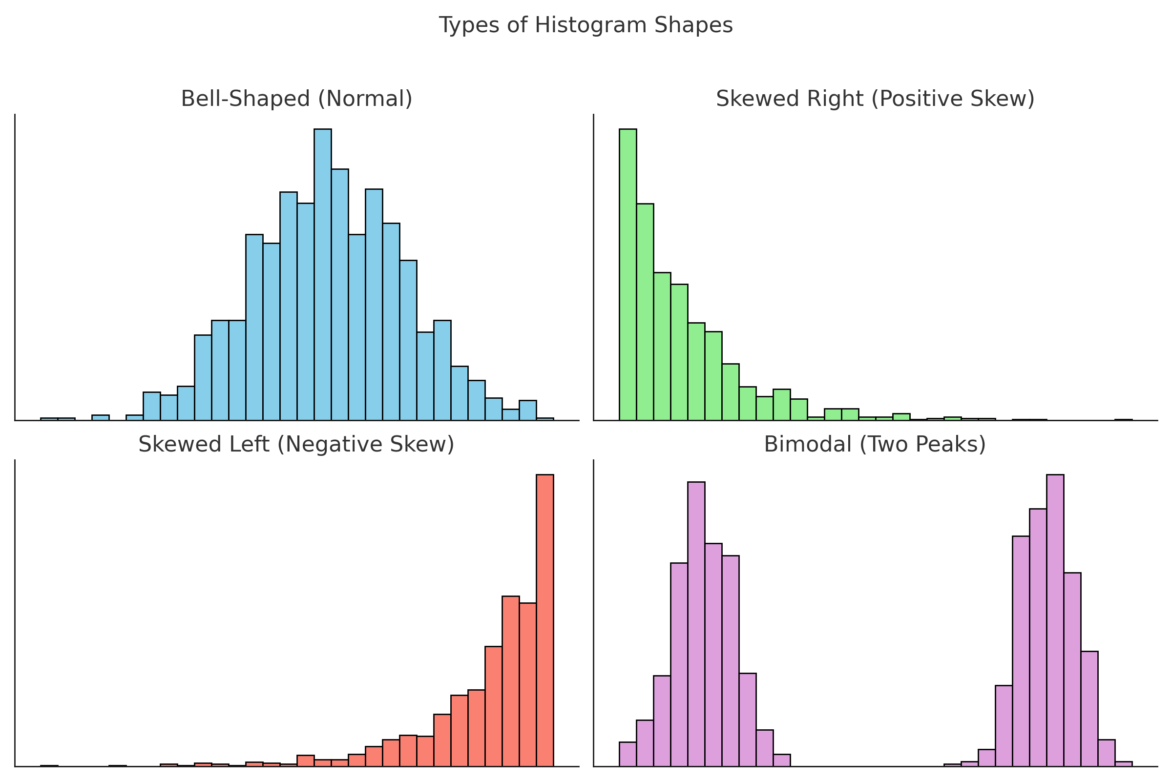
🧠 3. Types of Histogram Shapes
Histograms don’t just show data — their shapes tell a story.
📈 Bell-Shaped (Normal)
- Most data is in the center
- Few values at the extremes
- Example: IQ scores, height
🔄 Skewed Right (Positive Skew)
- Long tail on the right
- Most values are low
- Example: Income (most people earn little, few earn a lot)
🔃 Skewed Left (Negative Skew)
- Long tail on the left
- Most values are high
- Example: Age of retirement (most people retire around 60–65)
⛰️ Bimodal (Two Peaks)
- Two distinct groups in the data
- Example: Test scores from two different classes
🖼️ Visual Guide to Histogram Shapes
🤖 Why Data Visualization Matters in Machine Learning
Data visualization is a crucial step in any machine learning workflow:
- Explore distributions: Histograms and bar charts help you spot skewed data, outliers, or class imbalance before modeling.
- Feature selection: Visualizations reveal which variables may be most informative for your model.
- Model diagnostics: After training, graphs help communicate results, feature importance, and errors.
For example, a histogram of your target variable can reveal if you have enough positive and negative cases for a classification task.
🔍 ML Tip: Use bar charts to compare the number of samples in each class label (like 0s and 1s in classification problems).
✅ Best practices for choosing and designing graphs
- Match the graph to the data type. Use bar charts or pie charts for categorical data and histograms for quantitative data.
- Use high contrast and clear labels. Choose colors with good contrast and always label axes, categories, and titles clearly.
- Sort categories in a meaningful order. For bar charts, sort categories alphabetically or by frequency to make patterns easier to see.
- Show proportions when the total matters. Use pie charts or relative frequencies when you care about parts of a whole, and keep the number of slices small.
- Combine numbers and visuals. Use graphs together with simple tables or summary statistics to tell a complete story about the data.
⚠️ Common pitfalls with graphs
- Using pie charts with too many categories. Too many slices make it hard to compare sizes; use a bar chart instead when there are many categories.
- Mixing up bar charts and histograms. Bar charts are for separate categories with gaps between bars, histograms are for continuous intervals and use adjacent bars.
- Manipulating axes in a misleading way. Starting the y axis at a high value or using inconsistent scales can exaggerate or hide differences.
- Ignoring missing or zero values. If you drop missing or zero categories from the graph, the picture of the data can become misleading.
- Overloading graphs with decorations. Heavy gridlines, 3D effects, or too many colors can distract from the actual message of the data.
🧠 Level Up: Why Choosing the Right Graph Matters in Data Science
Effective data visualization is more than just making charts look nice — it’s about choosing the right tool to reveal insights clearly and accurately:
- 📊 Bar charts and pie charts work best for categorical data, helping compare groups or parts of a whole.
- 📈 Histograms are ideal for quantitative data, showing distribution shapes like normal, skewed, or bimodal.
- 🔍 The shape of a histogram can hint at underlying processes, identify outliers, and guide statistical modeling decisions.
- 🎯 Choosing the wrong graph can mislead viewers or hide important patterns — so the choice of graph is a vital skill.
Mastering graph selection will make your analyses clearer and your communication more impactful.
Audience & Purpose Tip:
Choose your graph based on your audience and your goal. For non-technical readers, simple bar or pie charts work best. For technical analysis, histograms or scatter plots might be more appropriate.
Try it yourself:
Use free tools like Plotly, Tableau Public, or Google Sheets to create your own interactive graphs and experiment with different data types!
📌 Try It Yourself
Q: You surveyed 200 people to find out their most-used social media platform.
Which type of graph would best show the results?
💡 Show Answer
✅ A bar chart or pie chart — because you're visualizing a categorical (nominal) variable.
Each bar or slice represents the number (or percentage) of people who prefer a platform like Instagram, TikTok, or X (Twitter).
Bonus: What if you had their daily screen time in hours instead?
💡 Show Answer
✅ Use a histogram — because screen time is quantitative and continuous.
A histogram shows how the data is distributed across intervals (e.g., 0–2, 2–4, 4–6 hours), which helps identify patterns like clustering or skewness.
🧾 Summary Table
| Data Type | Graph Type | Use When… |
|---|---|---|
| Nominal | Bar, Pie | Categories with no order |
| Ordinal | Bar | Ordered categories |
| Interval/Ratio | Histogram | Numeric data (continuous) |
✅ Up Next
We’ll build on this and create frequency tables — the building blocks behind many of these graphs!
📺 Explore the Channel

🎥 Hoda Osama AI
Learn statistics and machine learning concepts step by step with visuals and real examples.
💬 Got a Question?
Leave a comment or open an issue on GitHub — I love connecting with other learners and builders. 🔁